Colours in Interior Design and Histories That Connect Them
Hello everyone! For this blog we are going to do something quite different, instead of talking about a design trend, renovation tricks or any other kitchen-related topic we are delving into colour theory, history and how it can apply to interior design.
Truthfully, colour theory is subject to each individual, everyone interprets colours differently. For example, some people love the colour yellow and have a positive reaction to it, so much so that they want their whole glass splashback for their kitchen in bright yellow. Individually that choice looks amazing for them, however others would see that as too strong or not really a colour not fit for a kitchen. The point is everyone reacts to colours differently however broadly colours do have set meanings and reactions.
Red.
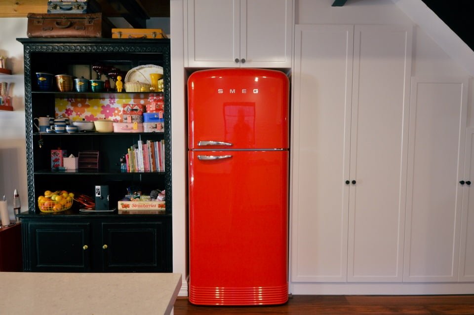
Red as a colour could possibly be one of the most differential colour psychologies to understand with its variety of meanings and general associations. Red in one format is associated with love and passion however contrary to this red can also have associations with danger. In an interior space, red is a unique but impactful colour when used correctly, due to this boldness red is a fantastic feature colour that can bring a retro element to a classic or modern design.
Red as a colour has some incredibly fascinating history dating all the way back to ancient Rome. Ancient Romans loved the colour red, it showed wealth, strength, and overall power to anyone seeing it through the colour of their interior walls or the colour of red on various paintings in the interior. However, despite it being such a sought-out colour in the ancient world acquiring the pigment, extracted from the highly toxic mercury was a deadly job left solely to the slaves. Once slaves would mine the toxic mercury the miners were essentially given a death sentence from their work
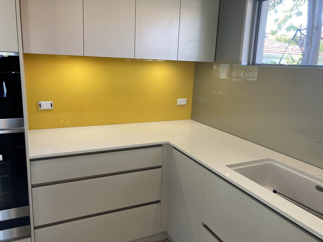
Yellow for many people is seen as a bright and cheerful colour reminiscent of summer days, carefree and happy. Yellow, similar to red, is another bold, bright colour that brings attention to anything that shares its colour. In interior design colours that have this brightness and emphasis are hard to balance without making the entire room about it. It is very rare for a client to specifically ask for yellow to be a hero of the room, however it is not so common for clients to want a vibrant, colourful room which brings excitement through its colour choices in which case yellow (if balanced correctly) can be a fantastic addition.
In China yellow has a strong association with happiness, glory and wisdom. The legendary first emperor of China was called the Yellow Emperor. The last emperor of China, Puyi (1906 – 1967, described in his memories how every object which surrounded him as a child was yellow “it made me understand from my most tender age that I was of unique essence”.
Black.
Colour association of black can vary depending on the individual and culture. According to a German scientist Hermann Von Helmholz “black is the real sensation, even if it is produced by the entire absence of light”. Black in the interior space can represent many aspects and create various stylish atmospheres from modern, Hampton and even eclectic. Most commonly black is used as a sophisticated element in modern designs from black marble benchtop in kitchens to black cabinets in bathrooms and laundries. Black can also be used as a simple two toning effect in Hampton kitchens to give the kitchen an extra element.
In Japanese history black is associated with mystery, the night, the unknown and the supernatural. In the 10th and 11th century of Japan it was believed that wearing black could bring a person’s misfortune. It was sometimes worn at court by those who wanted to set themselves apart from the established powers or who had renounced material possessions.
White.
In modern-day marketing the colour white is used to convey a feeling of safety, security, purity and freshness and there is a reason for that. White in the interior space is calming and simple, it is a fantastic base to work with and allows for the implementation of special elements in design that makes designs memorable. White acts as a muted base to allow other stronger colours to take emphasis in. Some designs want a contrasting element to make a design memorable, however in other cases having a harmonious white ‘light and airy’ aesthetic works beautifully.
White as a colour gets its association to purity from ancient times as in ancient Egypt priestesses wore white as a symbol of purity, while Romans wore a white toga as a symbol of citizenship.
That is a wrap for today’s blog, we hope you had some fun reading and learned some interesting facts about colours that you can bring up at the next dinner party.
Related Article: Creating New Spaces for Home Renovations in Perth